You should spend about 20 minutes on this task.
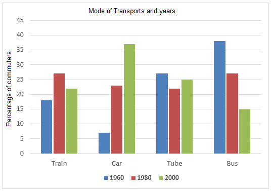
The graph below shows the different modes of transport used to travel to and from work in one European city in 1960, 1980 and 2000. Summarise the information by selecting and reporting the main features and make comparisons where relevant.
Write at least 150 words.
The types of transportation commuters in a European city depended to travel to and from their workplaces in three different years – 1960, 1980 and 2000 are delineated in the given chart.
Overall, when cars gained popularity buses lost their appeal. It is also seen that trains and tubes maintained an average rate of commuters over the period.
As per the chart, most people in the city travelled to and from work by bus in 1960. This was nearly 40%, which was almost 10% more than the people depended on tubes. Train travelers accounted for around 18%, whereas the least share of commuters travelled in cars (7%).
In 1980, there was a decline in the share of those who depended on buses and tubes and this was by almost 10 and 5 respectively. When approximately 10% more passengers boarded train, the growth in car commuters was almost its double.
By 2000, cars became the most popular mode of transport. When just over 35% of the working population travelled in cars, the percentage of those who commuted by bus shrank to 15. Around 22 to 25% people travelled on trains and tubes in the same year.
Word count: 177


