


You should spend about 20 minutes on this task.
The graph below shows the number of tourists visiting a particular Caribbean island between 2010 and 2017.
Summarize the information by selecting and reporting the main features, and make comparisons where relevant.
Write at least 150 words.
MODEL ANSWER>>>
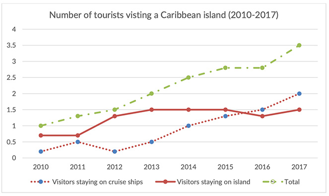
Fluctuations in the number of tourists who visited a specific island in the Caribbean islands between 2010 and 2017 are illustrated in the given line graph.
As per the data, in 2010, more tourists preferred to stay in the island than in the cruise ships. Almost 750,000 opted the first, which were 500,000 more than the second option. Though the number of visitors who stayed in the island stood constant in the next year, it almost doubled by 2013. An even fluctuation is noticed in case of those who stayed in the ships during this period, and this was between 0.25 million and 0.5 million. Then after, their numbers went up considerably to reach about 2 million in 2017, surpassing those who landed on the island between 2015 and 2016. On the other hand, the volume of those who stayed in the island was recorded at around 1.5 million during this time, despite a drop of about 0.25 million in 2016.
Overall, it is clear that the visitors’ attendance was climbing during the period, despite some fluctuations in the type of visit.
Word count: 168