You should spend about 20 minutes on this task.
The graph below shows the number of trips made by children in one country to travel to and from school in 1990 and 2010 using various modes of transport. Summarise the information by selecting and reporting the main features and make comparisons where relevant.
Write at least 150 words.
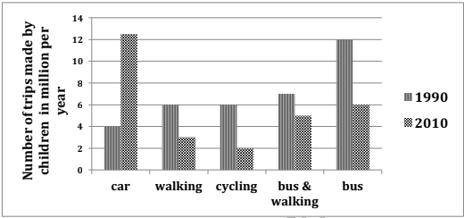
Information on the frequency of travel made to and from school by children aged between five and twelve in 2010 when compared to 1990 is depicted in the given bar diagram.
In general, the number of trips made went down in the latter year, except in case of those who travelled by cars.
As per the chart, most children in this age group went to and came back from school by bus, on cycle or on foot in 1990. When they made 12 million trips on bus alone, the number of trips they made by other modes ranged from six to seven million. The least number of trips were made by cars (4 million).
By contrast, in 2010, the number of trips made by cars shot up to over 12 million, whereas the frequency of travel by bus alone halved. There were substantial falls in the number of trips by children who went to and returned from school on foot and on cycle (from 6 million to just 2-3 million). Those who boarded bus and walked for commuting to and from schools also showed a negative growth, and this was by 2 million from 7 million in 1990.
Word count: 186