You should spend about 20 minutes on this task.
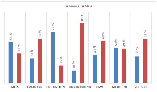
The graph shows the percentage of male and female academic staff members across the faculties of a major university in 2016.
Summarise the information by selecting and reporting the main feature, and make comparisons where relevant.
You should write at least 150 words.
The distribution of staff across seven faculties divided by gender at a major university in 2016 is depicted in the bar graph.
In general, a clear male dominance is visible in the staffing pattern of the university except in case of arts and education.
Of the male dominated faculties, engineering stood first, with an exceptional participation of 85% by contrast to 18% female participation. In the second place stood both business and science, where 62% of male staff was employed. In both these areas, the female staff proportion was about 36%. Not far behind stood law, with 60% male staff, when compared to 40% female staff.
Turning to the female dominated faculties, education stood first. When 72% of women staff worked there, the rate of male staff there was just 25. In case of arts, this was 58 and 42% respectively. The least difference is seen in case of medicine, when exactly 50% of women staff was there, which was just a per cent more than the male proportion.
Word count: 157