You should spend at least 20 minutes on this task.
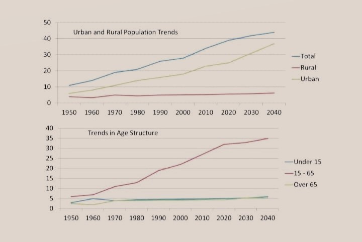
The line chart illustrates population trends globally by percentage from 1950 to 2040.
Summarize the information by selecting and reporting the main features and make comparisons where relevant.
Write at least 150 words.
The line graphs represent the trends in the global population in both urban and rural areas along with a classification based on age from 1950 till now, and its projection till 2040.
Overall, it is clear that the urban population is projected to grow in accordance with the growing aggregate population; the rural population is set to remain almost stationary as of now. Similarly, when the rate of population of 15-65 age group shows an inclining trend, the extreme age groups’ rates are not predicted to see a significant growth.
As per the first chart, in 1950, out of the 10% total growth seen in the population, almost half was there in the urban areas. From this point, the urban population is set to settle with over 35% growth in 2040. Even though the rural population growth rate showed a slight rise in the beginning it is anticipated to remain static, at around 7 by 2040.
Turning to the population classification based on age, those who are under 15 and over 65 did not show any major signs of growth rate, and is expected to be the same(around 5%). The 15-65 age group is seen having an inclining pattern, when its rate is anticipated to grow by 35% by 2040.