You should spend about 20 minutes on this task.
The line graph below shows the number of tourists visited Malaysia and Dubai from 1995 to 2003. Summarize the information by selecting and reporting the main features and make comparisons where relevant.
Write at least 150 words.
FOR VIDEO EXPLANATION: https://youtu.be/X4bODHIqqJw
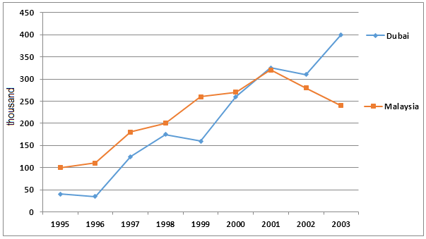
The line graph compares the number of tourists to two destinations: Malaysia and Dubai over a period of nine years from 1995.
Overall, Malaysia had more visitors in the last century, whereas the trend reversed in this century.
As per the chart, the number of tourists to Malaysia was 100,000 in 1995, whereas Dubai had not received even half of this number. Despite some mild fluctuations, the visitor number to Malaysia grew gradually to cross a quarter million by 1999. However, fluctuations were sharper in case of the tourists’ number who visited Dubai over this period. On its way to cross 250,000 visitors, which occurred a year after Malaysia had attained the target, Dubai saw two setbacks, one in 1996 (less than 50,000 visitors) and the other in 1999 (just over 150,000).
It is to be noted that by 2001, Dubai had slightly more visitors than Malaysia. It could hike the number of visitors to 400,000 from around 325,000 in 2001. Malaysia, on the other hand, lost its grip since 2001 and ended up with under a quarter million visitors in 2003.
Word count: 167