MODEL ANSWER>>>
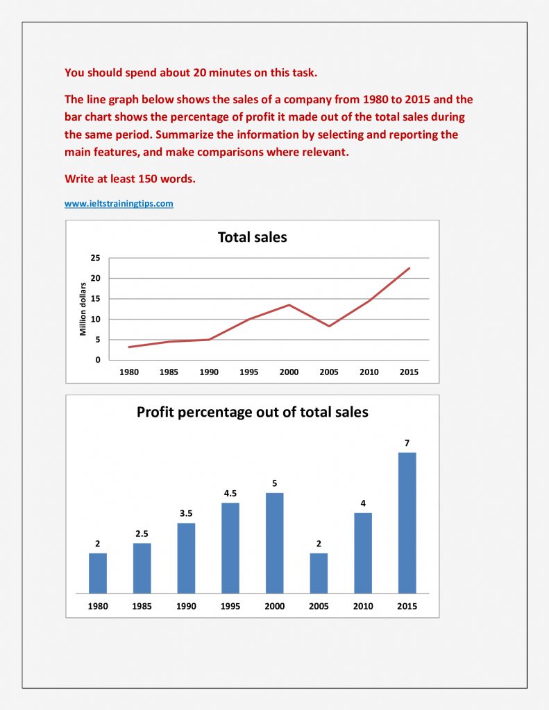
The aggregate sales of a company and its profit share from it between 1980 and 2015 are depicted in the given charts.
As per the line graph, the gross sales showed a progressive trend during the period, with an exception between 2000 and 2005. From 1980 to 1990, this grew from about 3.5 to 5 million dollars. A sharper growth occurred in the next ten years ($5 to $13.5 million). The highest growth was recorded between 2005 and 2015 with around $15 million ($8.5 to $23.5 million). The only exception was between 2000 and 2005, when there was a negative growth of about $10 million.
The profit share out of the total sales also showed a similar trend, when it grew steadily from 2% to 5% between 1980 and 2000. The growth resumed soon after a dip to 2% in 2005, to reach the peak of 7% in 2015.
Overall, it is clear that the total sales and its profit share of the particular company was almost directly proportional during this period.