You should spend about 20 minutes on this task.


You should spend about 20 minutes on this task.
MODEL ANSWER>>>
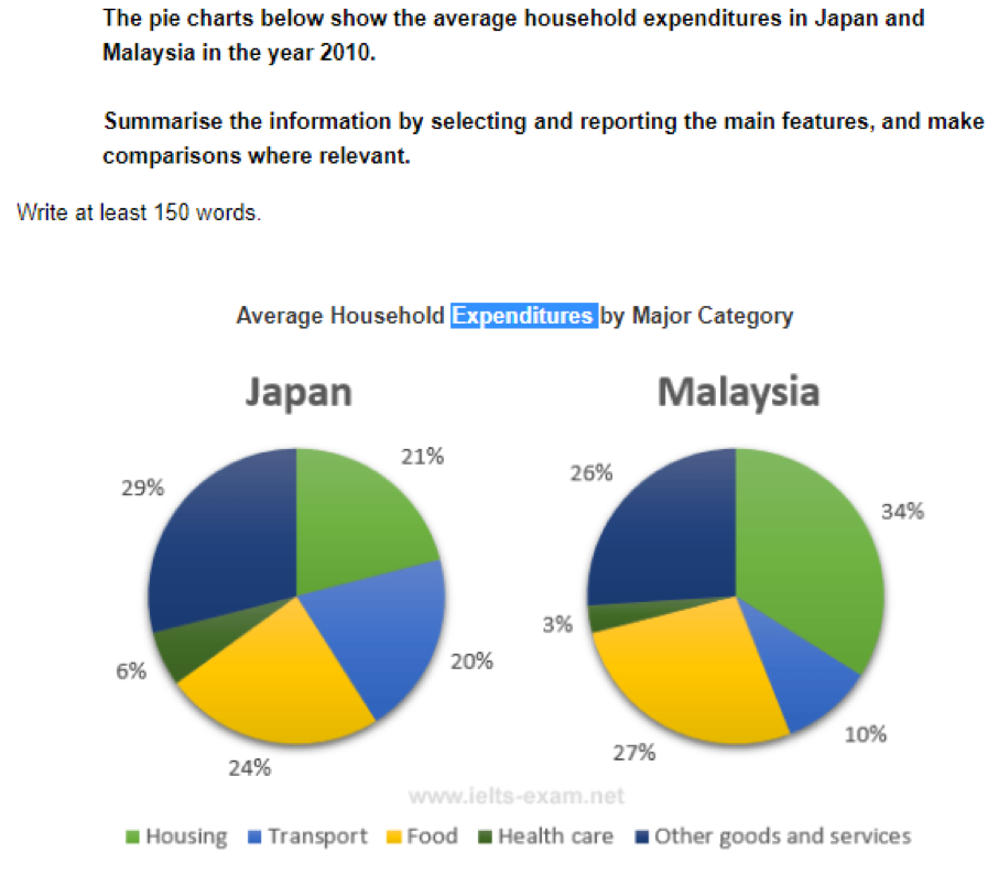
Information on the average household expenditures in Malaysia when compared to Japan in the year 2010 is depicted in the pie chart.
Overall, it is clear that except for housing and transport, both the countries had a similar disbursing pattern.
As per the charts, the Japanese household expenditure stood the highest for other goods and services, with 29% of the total expense. In Malaysia, this was 3% less.
On the other hand, Japan spent only 6% on health care, which was its least household expenditure. In Malaysia, the pattern was very similar, when they spent 3% lesser.
It was transport, the only other area in which the average Japanese domestic expense stood higher than the Malays. This was 20%, which was the double than that an average Malaysian citizen spent.
The share of food in the household expense in Japan was 3 % less than that was in Malaysia. Whereas the in case of housing, the disparity was 13% when the average expense of Malaysians crossed just over a third of the total.
Word count: 164