You should spend about 20 minutes on this task.
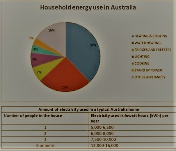
The pie chart below shows where energy is used in a typical Australian household, and the table shows the amount of electricity used according to the number of occupants.
Summarise the information by selecting and reporting the main features and make comparisons where relevant.
Write at least 150 words.
Information on the average energy consumption in an Australian household and the proportion of electricity used based on the number of occupants in an Australian home is portrayed in the given charts.
Overall, it is clear that the Australians use most energy for either heating or cooling, and the power consumption increases as the number of occupants in a family increases.
As per the first chart, a considerable amount of energy is used for water heating. This accounts for exactly a quarter of their total energy consumption, and is 13% less than their share of consumption for heating and cooling the rooms. Around 14% of the aggregate energy used by a household is used for refrigeration and lighting, and this is shared equally. The rates of consumption for cooking and stand by power are 4 and 3 respectively, while the remaining 16% is used via other appliances.
Turning to the table, when 5000 to 6000 kilowatts of electricity is used in a home with a single occupant, the amount rises between 12,000 and 16,000 kilowatts in a home with six or more occupants.