You should spend about 20 minutes on this task.
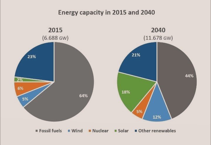
The pie charts below compare the proportion of energy capacity in gigawatts (GW) in 2015 with predictions for 2040.
Summarize the information by selecting and reporting the main features and make comparisons where relevant.
Write at least 150 words.
A comparison on the share of energy capacity in 2015 and its projection in 2040 is depicted in the given pie charts.
It is obvious from the charts that though fossil fuels would remain as the major source of energy in future, its share of energy capacity would decline, whereas the overall proportion of renewable energy sources is anticipated to gain.
In 2015, almost two-third of the total energy capacity (64%) comprised of fossil fuels. From the remaining 36%, the major share came from other renewables. Nuclear, wind and solar energy stood at third, fourth and fifth positions, with 6%, 5% and 2% respectively.
In 2040, the share of energy capacity from fossil fuels is projected to drop by 20%, and the major gainer in the share would be solar energy. From just 2% of the total energy share in 2015, it is predicted to jump to nearly a-fifth of the total in 2040. Another expected climb is for the wind energy, and this is from 5% to 12%. The shares of other renewables and nuclear energy are projected to slip by 1% to 2% in 2040.
Word count:169