


MODEL ANSWER:
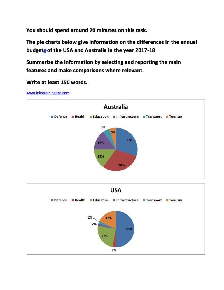
A clear cut comparison of the yearly budgets of the USA and the Australia in the year 2017-18 is shown in the given pie diagrams.
It is clear that the sector of defense is given notable weightage by both the countries in the period. In the USA, it was exactly half of the total budget, whereas in Australia, it was just less than a third of its total. America’s fund allocation share was higher in the fields of education and tourism, when it spent about one-fourth and one-fifth of the total budget on these. In Australia, out of a fifth of its total budget, 15% went for education, whereas the rest was spent on tourism.
The distribution of fund by Australia in its annual budget on health, infrastructure and transport was much more than that of the USA. This was 30%, 15% and 5% respectively, whereas in the USA, the budget share on all these sectors collectively accounted for only 7%.
Overall, it is clear that though both countries spent a sizeable share of their annual budget in defense, the pattern of fund allocation in other sectors was dissimilar.
Word count: 183