You should spend about 20 minutes on this task.
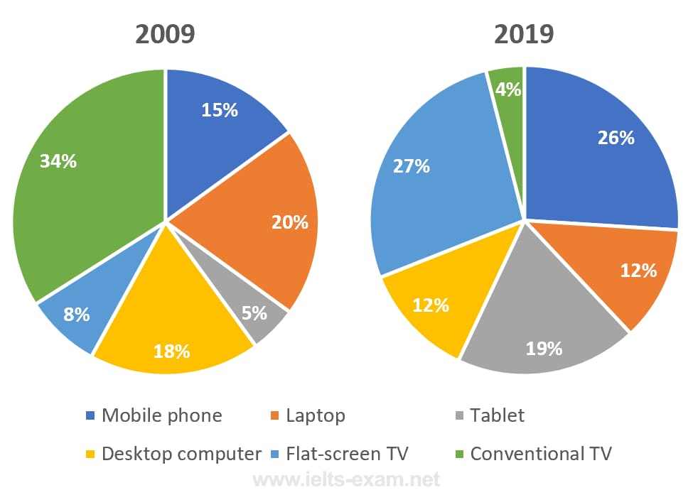
The pie charts below show the devices people in the 18 to 25 age group use to watch television in Canada in two different years.
Summarise the information by selecting and reporting the main features, and make comparisons where relevant.
Write at least 150 words.
The pie charts illustrates the way in which how people between 18 and 25 used to watch TV in Canada in 2019 differed from that of the year 2009.
Overall, it is clear that this young group focused their preference more on technologically advanced devices in order to watch TV.
It is clear from the chart that in 2009, most Canadians of this age group watched TV on a conventional device. When this accounted for just over a third (34%) of the total, exactly a fifth watched TV on their laptops. Desktop computer was the next preferred device in this year, with 18% viewers. Of the rest, 15% watched TV on their mobile phones, while the rates of viewers on flat-screen and tablets were 8 and 5 respectively.
By 2019, the proportion of those who used a conventional TV fell drastically by 30%, whilst the rates of those who used a laptop and a desktop for watching TV went down by 8%. On the other hand the share of TV viewers on flat-screen, mobile phones and tablets inclined dramatically. These figures leapt from 8%, 15% and 5% in 2009 to 27%, 26% and 19% respectively in 2019.
Word count: 176