


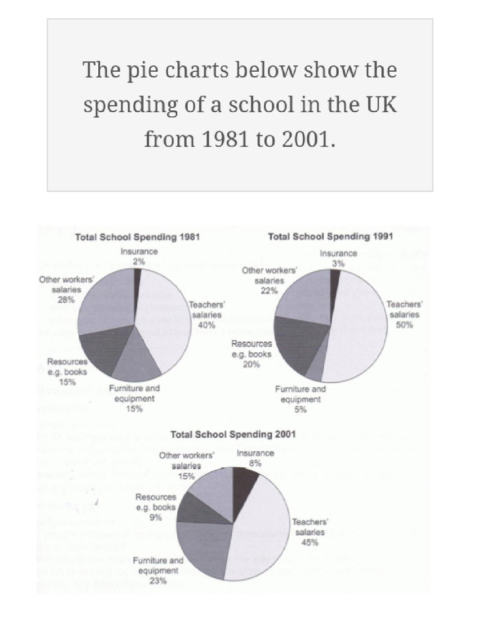
The way which the spending pattern of a school in the UK differed in 1991 and 2001 when compared to 1981 is depicted in the given pie charts.
Overall, it is clear that except the disbursement on teachers’ salary, which remained the most in all three years, the spending pattern exhibited major fluctuations.
In 1981, the school expended the most in giving salary to its teachers. Out of its total expenditure, this share accounted for exactly two-fifth. The next major expense was on the other workers’ salary, which constituted about 28%, followed by resource as well as furniture and equipment (15% each). Only 2% was spent on insurance.
In 1991, when the teachers’ salary rose by 10%, other workers salary shrank by 6%. The fund allotment on resources went up by 5%, whereas the share of spending on furniture and equipment slipped to 5% of the total. Insurance remained as the least area of financial attention (3%).
In 2001, there was a slight decline in the teachers’ salary. When it fell by 5%, the spending on furniture and equipment grew by almost five times (23%). The school’s expenditure on resources and other workers’ salary too declined to 9 and 15% respectively. However, its share of spending in the insurance swelled from 3 to 8%.
Word count: 194