You should spend about 20 minutes on this task.
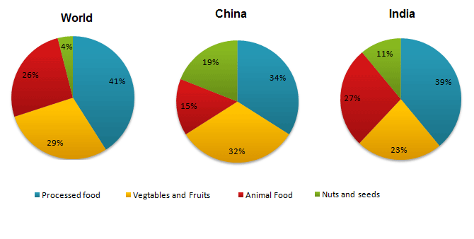
The pie charts show the average consumption of food in the world in 2008 compared to two countries; China and India.
Summarise the information by selecting and reporting the main features and make comparisons where relevant.
Write at least 150 words
The typical pattern of food consumption in China and India when compared to the global population in 2008 is depicted in the given pie charts.
Overall, it is clear that the consumption pattern of food differs in both countries when compared to the global pattern, except in case of processed food.
As per the charts, out of the total share of consumed food in the world in 2008, the lion’s share was processed food. This accounted for just over two-fifth (41%). When 29% of vegetables and fruits were consumed, the rate of animal products consumed was just over a quarter of the total. Nuts and seeds were taken the least, which was just 4%.
Processed food remained the most consumed food in both India and China at 39% and 34% respectively. Animal food consumption was also higher in India (27%) when compared to China (15%). However, in case of using other two products, China dominated India. Almost 32% of the Chinese food included vegetables and fruits, while Indians used only 23% of those. When around a fifth (19%) of the Chinese food consisted of nuts and seeds, in India, it was just 11% of the total.
Word count: 183